I like to think that the bankruptcy, this week, of American Airlines, was due – at least in part – to their poor choice of typeface.
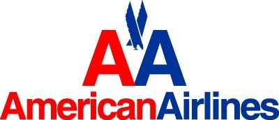
Look at their logo, sitting there in all its plain-jane, inoffensive, saccharine simplicity.
It is the child in the playground who always brought their lunch neatly wrapped? Their shoes were always clean and shirts perfectly pressed. They had few friends but couldn’t care less because their mummy was proud of them.
The child’s name is Helvetica.
The typeface blends with everything, yet is noticed by no one. It resides in your mind next to muzac, the colour of off-white and the odour of traffic fumes.
If you realised how ubiquitous Helvetica was, you would be sent insane.
One type designer, Cyrus Highsmith, did once try to avoid the typeface for a period of 24 hours. It didn’t end well. Hell, it didn’t even start well.
7.50 Morning. Time to get up. A Helvetica-free day! What will happen? Will I survive this typographic adventure?
7.55 This doesn’t look good. Almost all my clothes have labels set in Helvetica to explain how to wash them. I have found a Helvetica-free t-shirt, socks and underwear, but no pants yet. I work from home so it might not be a problem but I was planning to go into the city today for a meeting. yes, I need pants. Read more…
But back to American Airlines.

The logo above is the typographic counterpart to the ‘AA’ logo with stylised eagle. But the eagle was clearly weighing them down as they seemed to have dropped it from much of their marketing in recent years.
Keep it simple.
As LogoDesignLove points out, the AA logo was created by Vignelli Associates, a firm also responsible for the identity of Benetton (another fine moment in Helvetica).
You may also know and even like the font as it is used by the New York City Subway system. The spacing, the colour coded signs and the names of stations has made the use emblematic of Helvetica’s durability and suitability for seemingly any purpose.
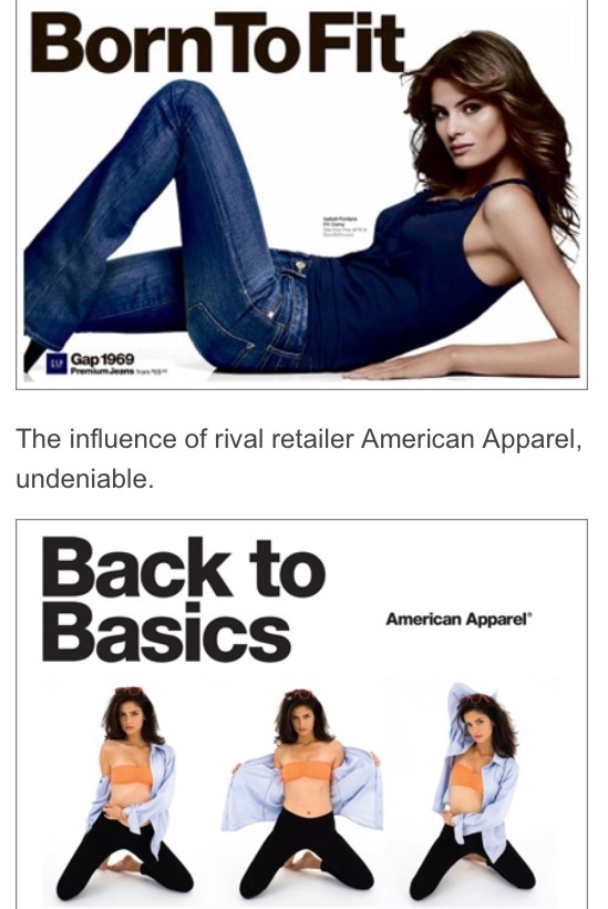
Sadly, this simplicity caught on and was soon copied holus-bolus by the clothing brand American Apparel.
Helvetica suited their ideals well. They want to represent the everyday American. They are straight-talking, unassuming, efficient and clean. Others can be edgy, this is all about a direct, All-American approach that gets things done… it’s like ordering fries, like driving an SUV, like buying a t-shirt, hell, they are so American they only employ Americans and do not outsource any labour.
Dov Charney, the 42-year-old founder and CEO of American Apparel, started a revolution when he declared consumers were given too many options and it took sweatshops to deliver them all.
“We keep feeding consumers these ridiculous choices,” Charney told Salon in 2004. “But it’s on the backs of inhumane labor.”
He wanted to standardise things.
Helvetica fitted the bill so neatly. (Except that Helvetica was designed in Switzerland, but that is beside the point.)
Eventually, other brands started to cotton on too. American Apparel faced a challenge from GAP, who ripped off not just the typeface but also the layout of their billboards.
Then, in some kind of meta battle, American Apparel started releasing standardised t-shirts of their standardised font choice.
You could buy a shirt with just a letter, in lower and upper case, or, eventually, a shirt paying tribute to the font itself.

Then, as this tragic, modeling hipster shows (below), the bland, painful circle was complete.
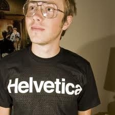
A shirt about the font that references the brand who made the shirt.
Puke.
I am no designer. But many designers do support me in this tirade.
Read David-The-Designer’s blog titled “52 Fonts You Could Use Instead Of Helvetica” in which he notes the dilemma is that people revert to this typeface in the same way they do old socks.
Helvetica, or its serif equivalent, Times New Roman, are, “more often than not, used without thinking – simply because it’s there. It’s successful though, there’s no denying that.”
I just hope that with the pending demise of American Airlines, society might also rein in Helvetica a peg or two. Think of it as an austerity measure – one to ensure future generations don’t have to endure such painfully normal fonts as they try to face daily life with enthusiasm and not lowest-common-denominator thinking.
