Obama’s campaign – no longer a font of wisdom

A quick typographical look at Barack Obama’s second presidential campaign, so far.

When Barack Obama’s first campaign appeared it was all strength and clarity. The HOPE poster made him and his message iconic. For some, the arrival of Barack Obama in American politics was nothing short of messianic. Now, with Obama facing a second-term showdown with Republican Mitt Romney, comes this…

Your President is now embracing into shabby-chic and oil burners. He wants you to feel warm in your own home – but not with strong leadership, diplomacy and economic stability but with Ugg boots and personalised Snuggies. This looks like something pinned by a pastel-wearing scrapbooker on Pinterest. Surely a message can target women without using mint green?

But it’s not just the feminised approach Obama is taking that is bothersome. His messages are clouded by so many different typefaces that any thread is lost amongst all the marketing tactics they are throwing up.

This poster is obviously not too big to fail. I can’t read it without concentrating closely. The multiple fonts are a mess and it feels like an optometrist’s test.

This is about as far from ‘presidential’ as it gets.Feels like an online t-shirt shop. (So I guess it got that right.)

Slick cases with the chunky block serifs evoking competitive NFL and NHL teams. So, it’s a youthful brand but still a bit combative. I like it. Click pic to see more in the store.

This one doesn’t even mention Obama by name. Reminds me of the woven badges I used to collect as a kid.

Standard Obama typeface in three different versions. And presented like bunting usually seen at a convention or a sporting event. George looks like he needs a Nespresso.

Oooo, that’s clever. And no doubt enough to convince some young voters that Obama is in fact Irish.

This is the most surprising use of frilly fonts to me. The titling of the event looks to be lifted from a cheesy royal wedding mug or the movie poster for a romantic comedy. I realise they are friends but this is taking it pretty far, even for a campaign clearly looking to target women

This underlining and alternating fonts – serif to sans-serif – is a familiar tool the Obama team uses and is brought over from the Obama HOPE campaign. You can scan it and immediately get the big points. What’s new is the rain, which tells us he is steadfast, embattled and he likes Kevin Costner films.

Next week: Romney employs bubble fonts.

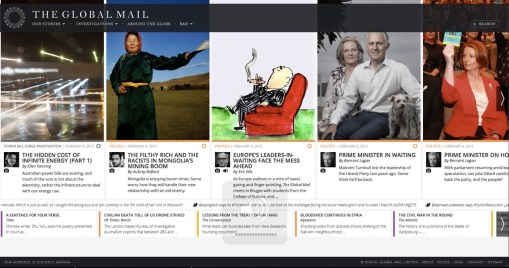
Gripes of wrath – My first look at The Global Mail

I was up late so I switched on the new Australian bastion of Independent Journalism, The Global Mail (TGM).

The website only went live last night but after twenty minutes or so I felt I had a good enough grasp of their plans to share my thoughts. And all my thoughts were about sharing. Because that’s what we do.

During the next day, today, I have seen some nastier reviews of TGM. This kind of spontaneous chatter, the fleeting engagement that social media elevates into conversation is still worthwhile and I am confident the editors won’t see the negatives as carping but as people wanting to be proud of a standout moment in our media culture, to make a good thing great.

My email to the editor went something like this.

Hello,
Thanks for launching your new venture – it has already kept me up past midnight so that can’t be a bad thing.

Having read a few articles, each of which I appreciated, I found myself wanting more, more links to topics raised, more options for looking at the source material and a chance to delve further into the life of the author. Sadly, none of these options are present on your site. My hopes were that TGM would bring a fresh new look to independent storytelling – which it does, I am enjoying the interface and typesetting – but also that it would nail the sharing mentality that is now spearheaded by social media. As for me and my generation, this is how we consume media; it is second nature to ping our friends as we read a story, to tweet a thought, to grab a quote (preferably out of context) or to drag a photo to show our followers.

I hope that your site is already aware of these trends and plans to roll out such solutions in coming weeks. It is, after all, our first night together and I realise it’s unfair expecting everything to be just right.

So, how about it? How about a Google+ button, hyperlinked issues within stories, article tags and photos that link to more photos from that event or photographer. Right now TGM feels to me like a broadsheet copied onto a website.

I look forward to seeing where else you take it – and where I can take it.

Cheers, Luke.

%d bloggers like this: