When Apple changed the colour scheme on their iconic iPhones last year, many obsessive fans – including me – whinged about the decision. Childish. Dated. Simplistic.
Others thought it was more proof that Apple is always ahead of the curve. That their team knew, ahead of time, what colours would soon be in fashion in the world of design. But to me, that sounded too much like Miranda in The Devil Wears Prada.
I realise someone out there must be able to see through the glare of advertising and know what’s actually coming next. But a company as big as Apple?
What changed?
The colours used throughout the iPhone were given a stark and bold new look. With blurry backgrounds and barely perceptible gradients the icons now had a certain lift – it was as if they were rising off the screen.
Now, months later, I see the same once-hated palette popping up everywhere. Did Apple predict a trend or did they create one?

So where did Apple’s new colour theory originate?
Theory 1: Did they have a secret colour chart like you see at the hardware store?
See also: flatuicolors.com
Theory 2: Now everything was plain, unadorned and less skeumorphic – putting an end to the use of that ridiculous word.
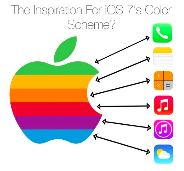
Was the pallet simply Apple’s old logo, reimagined?
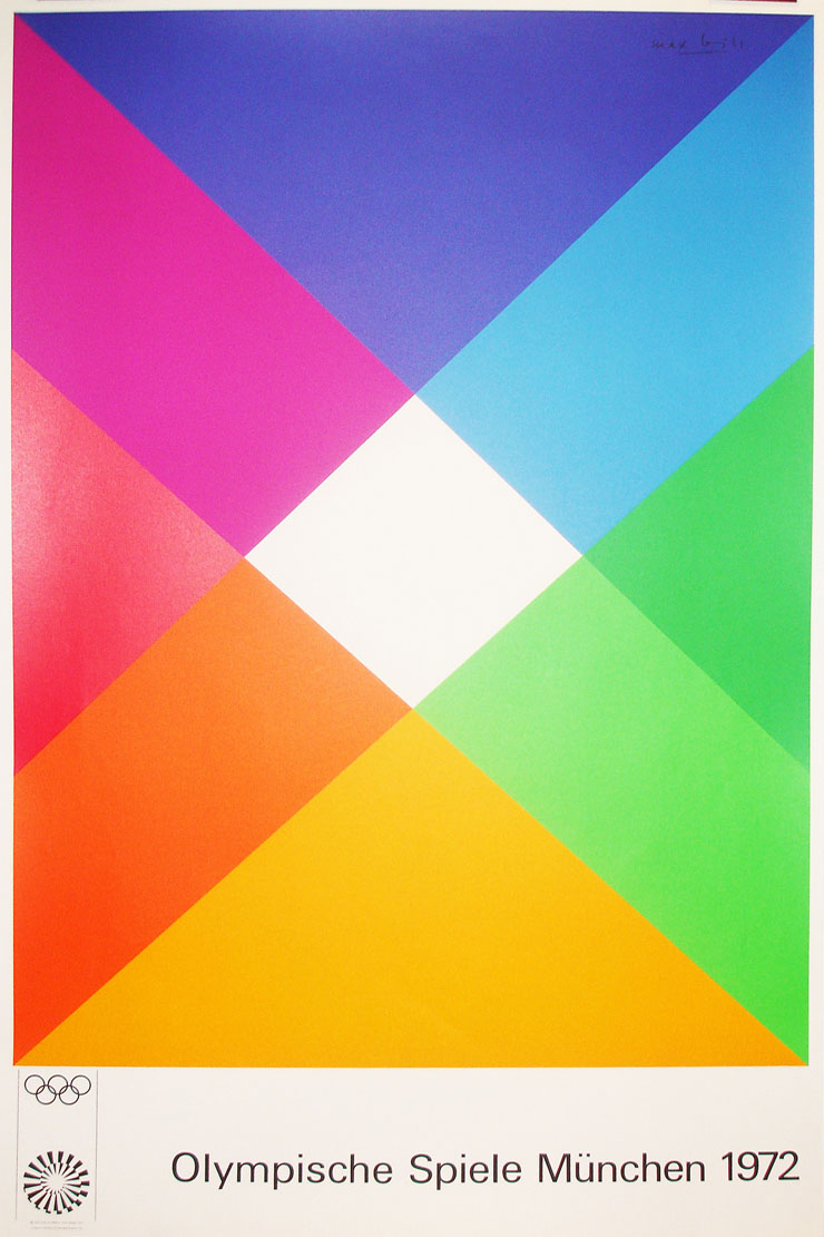
Theory 3: Or were the colours lifted from the work of designer Otl Aicher for the 1972 Munich Olympic Games? (This is my favourite theory.)
Apple’s chief designer Jonny Ive may let us know one day, but if he does, it will be on his deathbed. And even then it’s unlikely.
So all we can do is now observe how the same palette has taken hold in other designs around the world.
Telstra want to be part of the cool. Good luck, blonde beardy.
-

- f3008c252e3b2e89dffabba281a1bdc5
-

- d937f461f80d0aa03fb305b8299db822
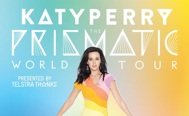
Katy Perry gets it. And she kissed a girl before it was cool.
Don’t forget Samsung, the iPhone you get when you don’t want an iPhone.

And let’s not forget the contribution from Sydney’s rail network – the Opal card.

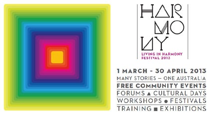
Or Sydney City Council’s efforts in promoting Harmony.
I believe that Apple – a company known for behaving outside of common corporate rules – did manage to help create a colour trend. Their influence on global design is not marginal. Apple have sold over 500 million iOS devices worldwide, meaning that even if a flat colour trend was approaching, they accelerated it by placing it in the hand of around half a billion consumers.
Then, eventually, the trend has trickled down to graphic designers, celebs, advertisers, stylists, city councils and less nimble smartphone manufacturers.
Seen any other examples? Do tell.
More reading:
- Apple got its colour palette from Apple’s old logo | iSource
- Simplicity is actually quite completed | Apple
- Apple’s Radical Overhaul Of The iPhone’s Software May Have Been Influenced By This Legendary German Designer | Business Insider
- Otl Aicher and the 1972 Munich Olympics
- Munich ’72 Design Legacy
- Flat Design, iOS 7, Skeuomorphism and All That | tutsplus.com
| Evernote helps you remember everything and get organized effortlessly. Download Evernote. |
